
'TaxBandits Design System' is the source of truth that will answer all your design.
'TaxBandits Design System'
is the source of truth that will answer all your design.
Latest Design
Atoms & Foundations
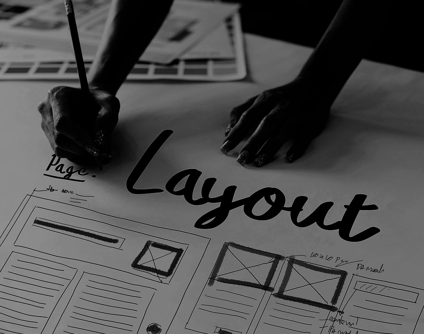
Layout
Spacing

Colors
Iconograghy
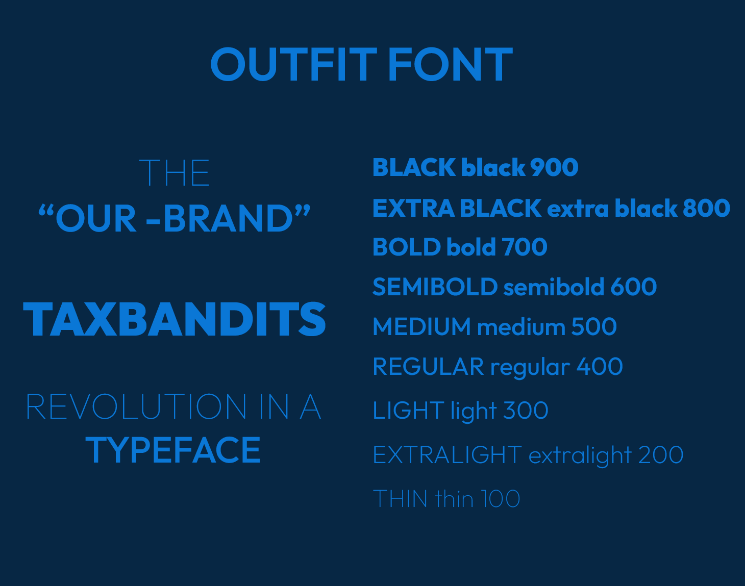
Typograpghy
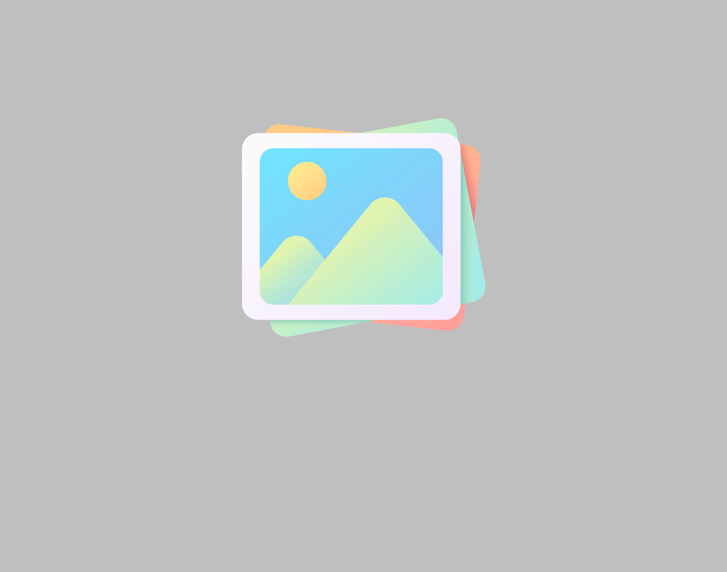
Images
Box Shadow
Border Radius
What We Do
Components
Avatars
An avatar in UI design is a graphical representation of a user, typically displayed as a small image, icon, or illustration. Avatars help personalize the user experience, making interactions feel more engaging and familiar.
Breadcrumbs
Breadcrumbs are a secondary navigation element that helps users understand their location within a website or application. They show a hierarchical path, making it easy for users to navigate back to previous pages.
Buttons
Buttons are interactive UI elements that trigger actions when clicked or tapped. They help users navigate, submit forms, or perform tasks within an application or website.
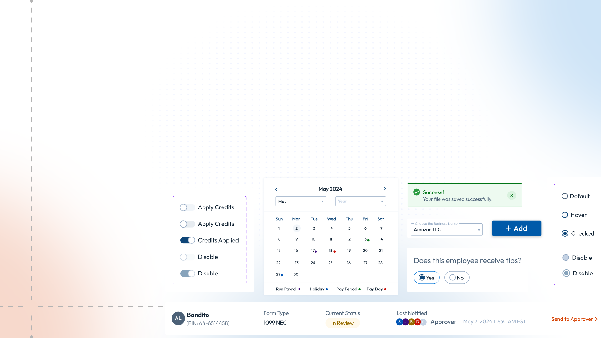
Calendar
A calendar in UI design is a component that helps users select dates, view schedules, or manage events efficiently. It is commonly used in date pickers, scheduling apps, and booking systems.
CheckBox
A checkbox in UI (User Interface) is an interactive element that allows users to make a binary selection—either checked (selected) or unchecked (deselected). It is typically represented as a small square box that can be toggled on or off.
Count Badges
A count badge in UI is a small, often circular, visual indicator that displays a number or status on an element, typically to highlight notifications, messages, or updates. It is usually placed at the top-right corner of an icon, button, or tab.
Pagination
Pagination is a UI pattern used to divide large amounts of content into multiple pages, allowing users to navigate through data efficiently. It is commonly found in tables, search results, blog listings, and dashboards.
Radio Buttons
A radio button is a UI element that allows users to select only one option from a predefined set of choices. It is typically represented as a small circle that, when selected, gets filled with a dot.
Upload
The Upload UI component allows users to select and upload files (such as images, documents, or videos) from their device to a server or application. It is commonly used in forms, dashboards, and content management systems.
Toggle Switch
A toggle switch is a UI element that allows users to switch between two states, typically ON and OFF. It functions like a physical switch and is commonly used for enabling or disabling settings.
Toasters
A toaster in UI is a small, temporary notification that appears on the screen to provide feedback or alerts, usually fading out after a few seconds. It is commonly used for success messages, warnings, or errors.
Tooltips
A tooltip is a small, contextual pop-up that appears when a user hovers over or focuses on an element, providing additional information or guidance without cluttering the UI.
Inputfields
An input field is a UI element that allows users to enter and edit text, numbers, or other data, commonly used in forms, search bars, and login fields.
Progress Bar
A progress bar is a UI component that visually represents the completion status of a task or process, such as file uploads, downloads, or form submissions.
Tabs
Tabs are a UI component that allows users to switch between different sections or views within the same window, organizing content efficiently without navigating to a new page.
Loader
A loader is a UI element that indicates a process is in progress, such as loading data or fetching content, typically represented by a spinning icon, progress bar, or animation.
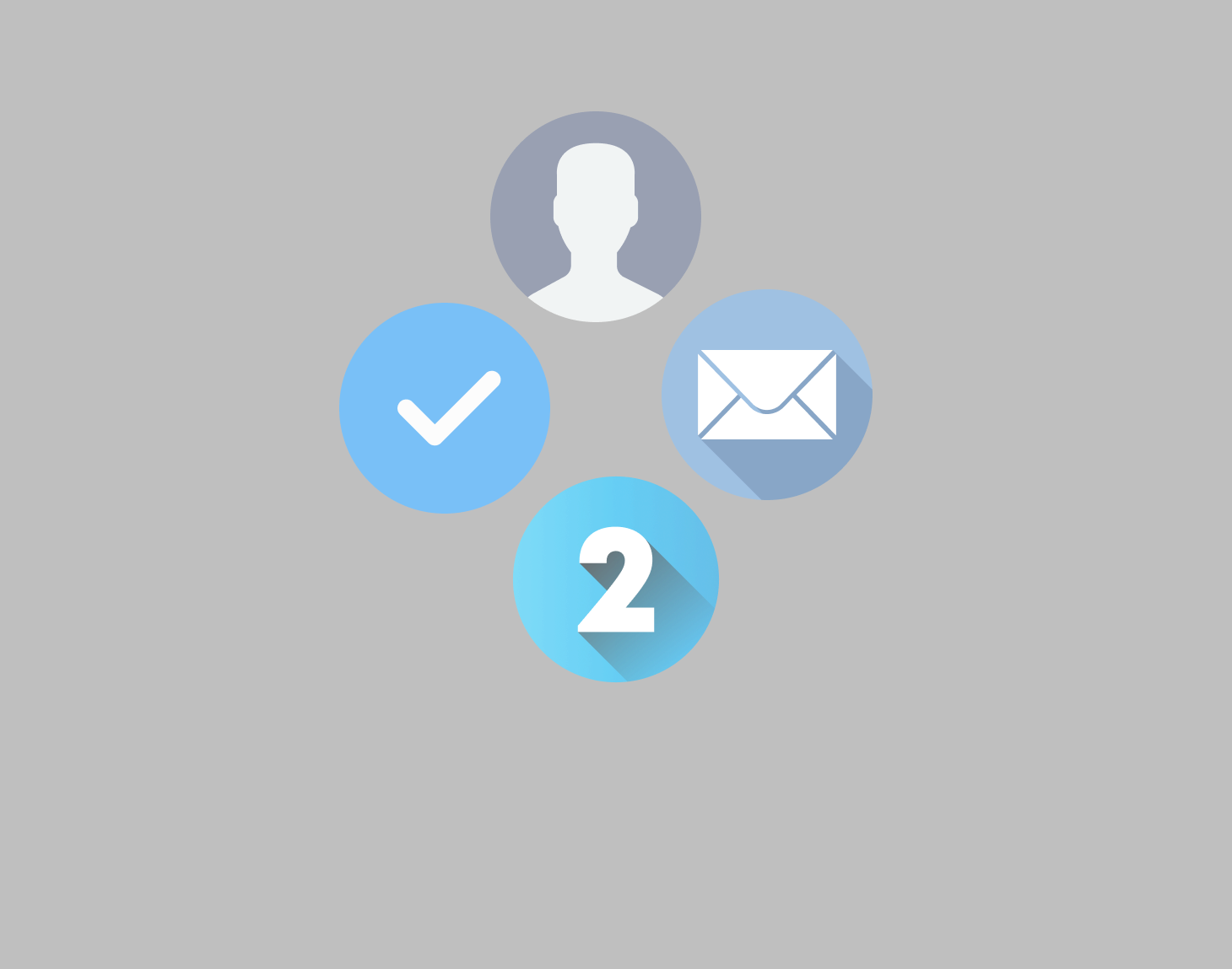
Wizards
A wizard is a UI pattern that guides users through a multi-step process by breaking it into sequential screens, making complex tasks easier to complete.
UI Enhancement
UI Changes
An avatar in UI design is a graphical representation of a user, typically displayed as a small image, icon, or illustration. Avatars help personalize the user experience, making interactions feel more engaging and familiar.