
UI Change
UI is a design is a technique used to divide content into separate pages, typically with a limited number of items per page. It allows users to navigate through large sets of data or content easily and efficiently. Pagination enhances usability by breaking down information into manageable chunks, preventing overwhelming users with too much information at once.
Bulk Upload Screen


Popup Screen


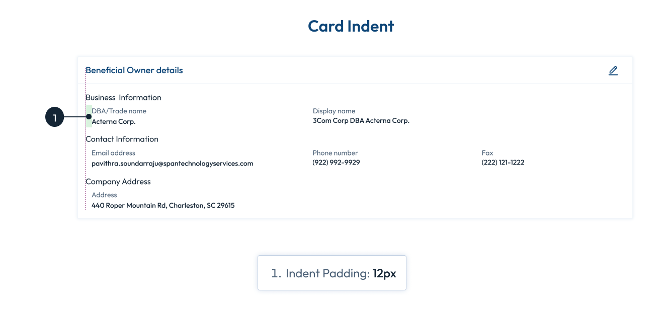
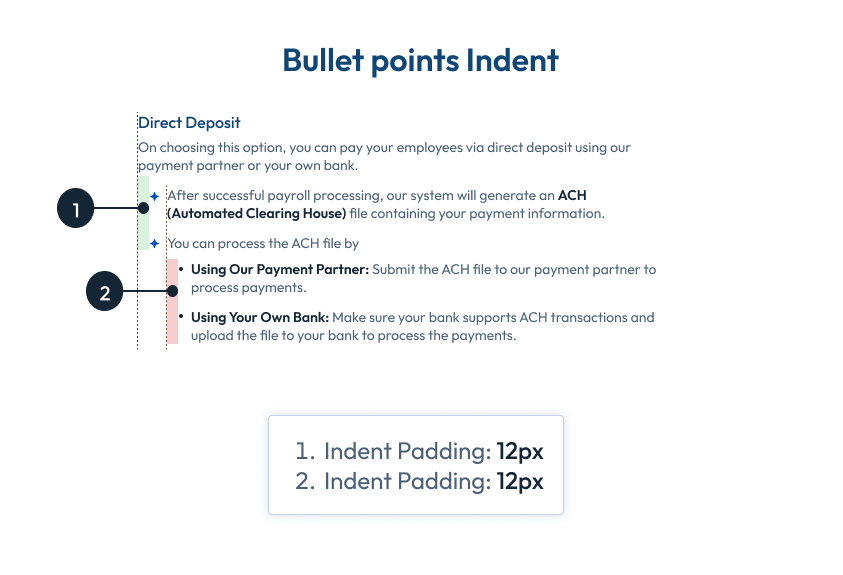
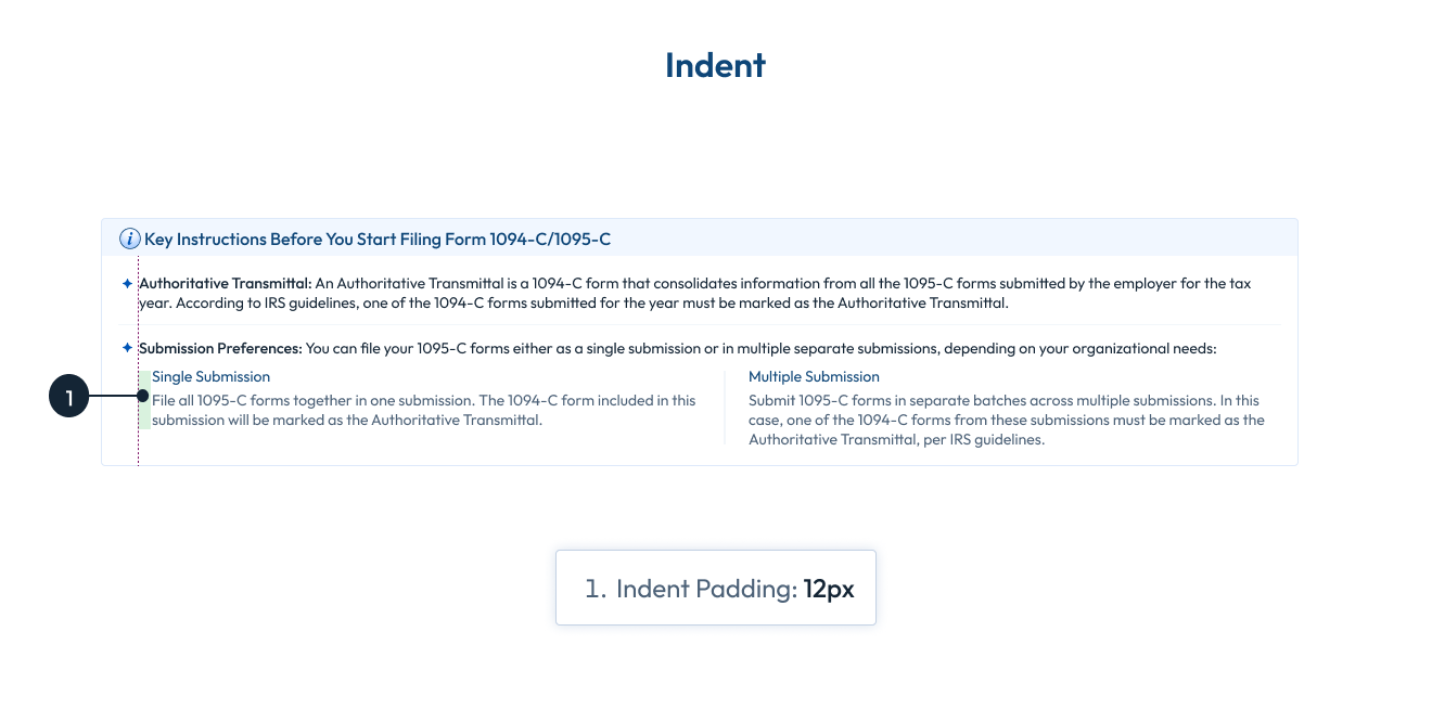
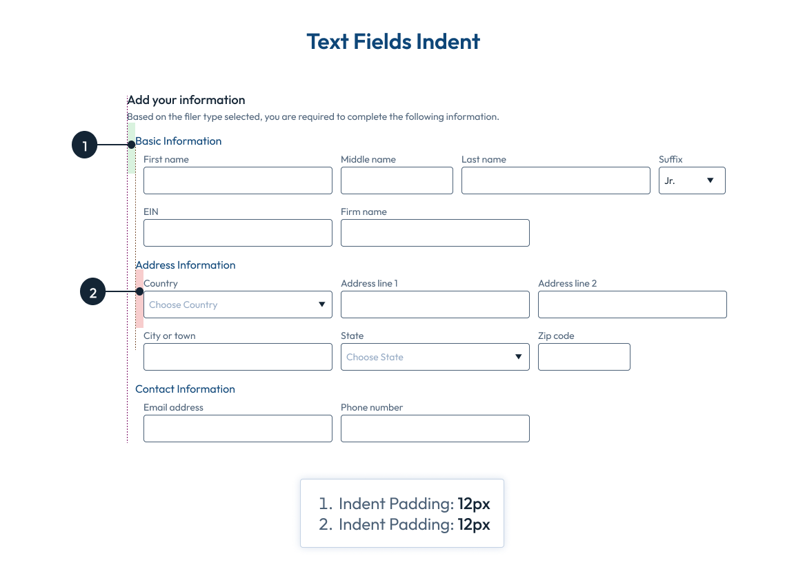
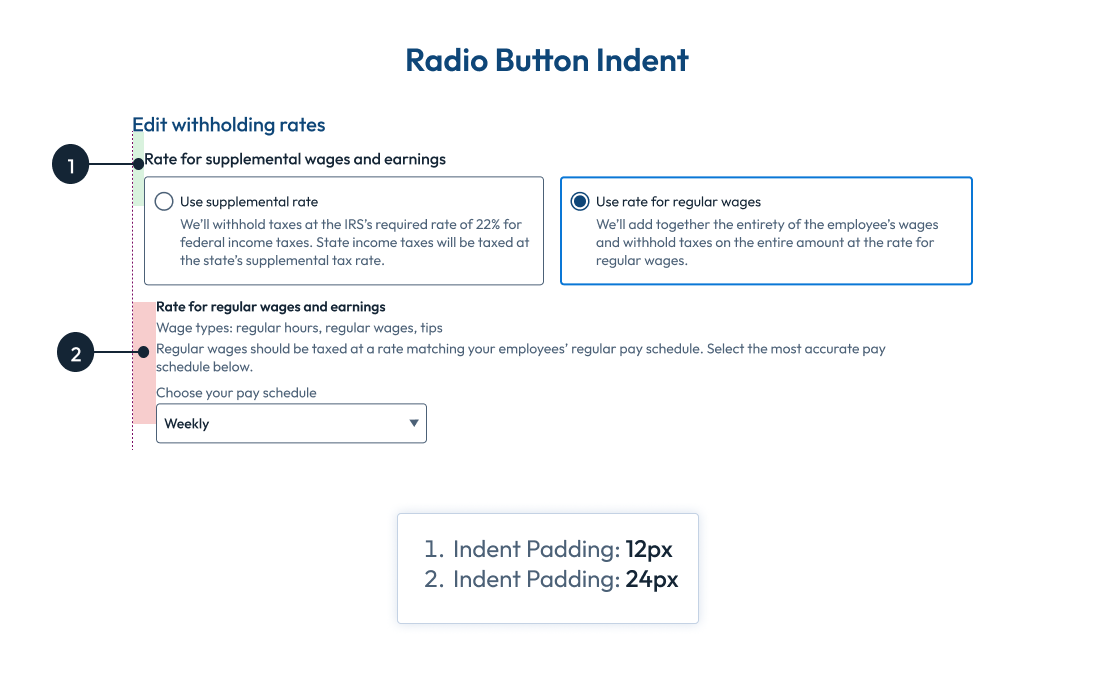
Indent
Wizards
Wizards are step-by-step processes that guide users through complex or multi-step tasks. They are particularly useful when a task involves multiple inputs, decisions, or configurations that might otherwise overwhelm the user if presented all at once. Here’s a breakdown:
Key Components of a Wizard in UI
-
Step-by-Step Navigation:
- Progress Indicator: Shows how far the user has progressed and how many steps are left.
- Example: "Step 2 of 5."
-
Clear Instructions:
- Each step should focus on a single task or question, keeping the user focused.
-
Back/Next Buttons:
- Allow users to navigate between steps easily.
Wizards
4-Point Grid System is a framework for designing and laying out user interfaces using increments of 4 pixels (or points) for spacing, sizing, and positioning elements. It ensures consistency, alignment, and balance in the visual design, making interfaces more predictable and easier to scale across different screen sizes.

-
1Horizontal Padding: 16px
-
2Radius: 25 x 25
-
3Padding between text and Icon: 16px
-
4Padding between two wizards: 16px
-
5Icon Size: 16px
-
6Height of Tab: 28px
-
7Font size: 14px Regular
-
8Active: 14px Medium